The Impact of Color on Mood and Emotion
Understanding how color can affect our emotional and psychological states is both a science and an art. From the subtle influence of muted tones in our homes to the vibrant hues used in advertisements, color plays a profound role in shaping how we feel, behave, and perceive the world around us. This page delves into the fascinating connection between color, mood, and emotion, exploring both psychological theories and practical applications.
The Psychology Behind Color Perception
The Science of Seeing Color
When light enters the eye, it stimulates specialized cells in the retina called cones, which are sensitive to different wavelengths corresponding to the colors red, green, and blue. These signals are then processed by the brain, which interprets them as the rich spectrum of colors we perceive. This biological process is foundational to color perception, but it is only the starting point for color’s influence on mood—our brains further assign meaning and emotional weight to these visual stimuli based on past experiences and context.
Emotional Coding in the Brain
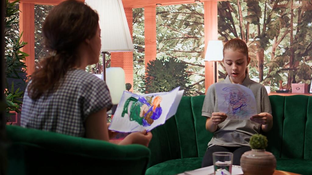
The human brain is remarkably adept at associating colors with feelings and memories. Certain hues can activate the limbic system, the area of the brain responsible for emotion, motivation, and long-term memory. For example, the color red is often associated with excitement and urgency, possibly due to its prevalence in nature as a warning signal. Meanwhile, blues and greens generally produce a calming effect, as these colors are reminiscent of peaceful skies and serene landscapes. Our unique personal experiences also attach significance to color, making emotional reactions highly individualized.
Cultural Influences on Color Meaning
Culture plays a pivotal role in shaping the emotional resonance of color. While white is associated with purity and weddings in Western societies, it signifies mourning in some Eastern traditions. These cultural variances demonstrate that our emotional relationship with color is not solely biological but also deeply influenced by societal norms, rituals, and traditions. Globalization continues to blend these meanings, but the cultural context remains a powerful filter through which we interpret the emotional impact of color.

Impact of Colors in Home Settings
The colors chosen for our homes can dramatically affect our emotional health. Soft, cool tones such as blues and greens tend to encourage relaxation and tranquility, making them ideal for bedrooms or retreat spaces. Warm hues like yellows and oranges can evoke feelings of warmth and cheerfulness, particularly suited to social spaces like kitchens and dining areas. Thoughtful application of color at home not only enhances aesthetic appeal but can also promote desired emotional states for residents and guests alike.

Office Color Schemes and Productivity
Work environments benefit greatly from carefully selected color palettes. Studies suggest that blue tones help to enhance focus and concentration, while green hues can reduce eye strain and promote a sense of balance. On the other hand, splashes of red may be strategically used in settings where physical activity or urgency are required, as it can boost energy and alertness. Employers and designers who understand these color-mood relationships can create workplaces that not only look inviting but also maximize efficiency and employee well-being.
The Emotional Spectrum of Colors
Warm Colors and Their Energizing Effects
Warm colors like red, orange, and yellow are often associated with energy, passion, and warmth. Red, in particular, is linked with increased heart rate and adrenaline, making it a stimulating choice for spaces where enthusiasm and activity are desired. Orange combines the vitality of red with the cheeriness of yellow, creating uplifting settings, while yellow itself is often seen as a color of happiness and optimism. However, overuse of these intense hues can sometimes evoke feelings of restlessness or anxiety, highlighting the need for balance in their application.

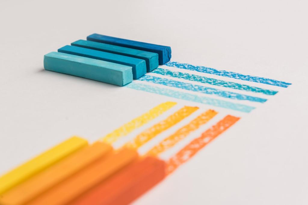
Cool Colors and Their Calming Influence
Blues, greens, and purples sit on the cool end of the color spectrum and are generally recognized for their calming and soothing effects. Blue, reminiscent of the sky and water, encourages a sense of peace and stability. Green, evoking nature, is often associated with renewal, growth, and tranquility, making it ideal for spaces dedicated to relaxation and rejuvenation. Purple, a blend of stimulating red and calming blue, is often linked to creativity and luxury, offering a sense of balance between energy and calm.