Exploring Color Theory in Interior Design
Discover how color theory shapes the ambiance, aesthetics, and emotional resonance of interior spaces. Master the essentials of color combinations, understand their psychological impact, and learn how professionals use color to transform environments, influence perceptions, and achieve desired atmospheres in homes and commercial settings.
The Fundamentals of Color Theory
Primary, Secondary, and Tertiary Colors
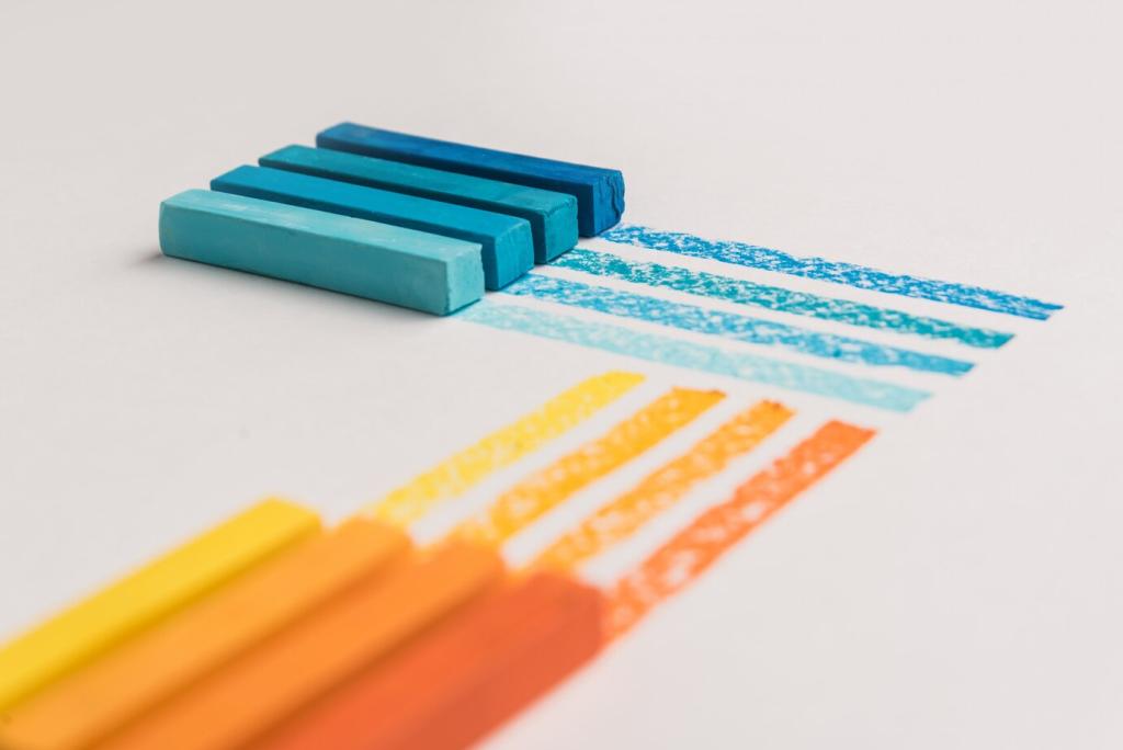
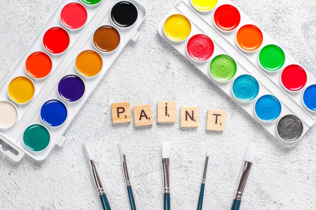
The color wheel serves as the primary tool for designers, mapping out the relationships between primary, secondary, and tertiary colors. Primary colors—red, blue, and yellow—are the source from which all other colors are derived through mixing. When two primary colors combine, they form secondary colors like green, orange, and purple. The blending of primary and secondary hues gives rise to tertiary colors, further expanding the palette. Mastering these basics allows designers to predict how colors will interact, ensuring that spaces transition smoothly between different tones and temperatures.
Warm vs. Cool Colors
One essential aspect of color theory is distinguishing between warm and cool colors, as these distinctions dramatically influence the perceived mood of a room. Warm colors, such as reds, oranges, and yellows, tend to evoke energy, intimacy, and warmth—perfect for lively gathering spaces. Conversely, cool colors like blues, greens, and purples foster relaxation and calm, making them ideal for bedrooms and retreats. By thoughtfully choosing warm or cool palettes, designers manipulate the emotional flow within an interior environment, tailoring it to the intended function of the space.
The Role of Neutrals in Design
While bright, bold colors attract attention, neutrals lay the foundation of balanced design. Shades such as whites, greys, taupes, and blacks serve as essential backdrops, offering contrast, rest, and cohesion among bolder elements. Neutrals allow for flexibility, making it easier to refresh décor without a complete overhaul. They also enhance light reflectivity in a space, contributing to an illusion of openness or intimacy. Understanding how to use neutrals effectively is key to achieving timeless interiors that can accommodate shifting design trends.
Emotional Impact of Color Choices
Every hue inspires specific psychological responses: blues evoke serenity and trust, reds ignite excitement and passion, and greens suggest renewal and harmony. When selecting colors for an interior, designers consider the activities and feelings they wish to promote. For example, a vibrant color palette might energize a fitness studio, while muted earth tones can calm a medical office. The emotional resonance of color sets the tone for how a space is experienced, making it an essential factor in the design process.
Personal Preferences vs. Universal Reactions
While color psychology provides general guidelines, individual preferences also play a significant role. Personal experiences, cultural associations, and even age can influence how someone responds to color. Some might find yellow uplifting, while others perceive it as overwhelming. Effective interior designers balance these universal reactions with personalized touches, ensuring the space resonates on both collective and individual levels for those who will use it.
Using Color to Influence Behavior
Designers often employ color to subtly direct behavior within a space. In educational environments, cool colors can help students focus and remain calm, while in restaurants, warm colors may stimulate appetites and foster social interaction. Through thoughtful application, color can gently guide how people move, feel, and function, optimizing the environment for its intended purpose. Recognizing this power elevates the impact of every shade chosen.
Color Harmonies and Combinations
Complementary Color Schemes
Complementary colors are positioned opposite each other on the color wheel, such as blue and orange or red and green. When used together, they intensify each other’s visual presence, creating dynamic contrast within a space. This high level of vibrancy can enliven a room but requires careful balance to prevent sensory overload. Designers often employ complementary schemes for accent walls, accessories, or focal points, ensuring energy without overwhelming the room’s balance.
Analogous Color Schemes
Analogous color schemes consist of colors that sit side by side on the color wheel, such as blue, blue-green, and green. This approach produces a harmonious, unified look that feels natural and restful to the eye. Such combinations are particularly effective in spaces meant for relaxation and continuity, as the transitions between hues are subtle and soothing. While analogous schemes are less dramatic than complementary ones, they excel at creating serene and cohesive atmospheres.
The Power of Monochromatic Palettes
A monochromatic palette employs variations in lightness and saturation of a single color. Far from monotonous, this approach enables nuanced layering and depth, offering interest while maintaining overall unity. Monochromatic schemes are ideal for spaces requiring a minimalist or sophisticated touch, as they accentuate texture and form rather than relying on contrasting colors. The result is an elegant interior, unified by tone yet rich in visual interest.
Color and Space Perception
Making Spaces Appear Larger or Smaller
Lighter colors, such as whites, creams, and pastels, reflect more light and help spaces feel airy and open, making them ideal for smaller rooms. Conversely, darker shades absorb light and visually contract a space, fostering intimacy and warmth. Designers can use this knowledge to adjust how proportions are perceived—expanding small living rooms or making vast, open-plan areas more inviting by defining zones with deeper tones.
The Effects of Color Placement
Where a color is applied can drastically alter the spatial perception of a room. Painting ceilings a lighter shade than the walls lifts the visual height, while adding an accent wall in a dark or saturated color draws attention and can elongate or shorten the perceived depth. Understanding these subtleties allows designers to correct awkward proportions, highlight architectural features, or create intentional focal points simply through color.
Using Patterns and Color Together
Beyond flat color application, the integration of patterns expands the toolbox for manipulating space. Stripes, chevrons, or geometric prints in strategic colorways can stretch or compress visual boundaries; for instance, horizontal bands can widen a room, while vertical patterns raise the ceiling. By pairing color and pattern, designers craft spaces that are both functional and visually compelling, tailored precisely to the client’s needs.
Seasonal and Trend-Driven Color Palettes
Spring and summer encourage the use of vibrant, energizing hues that mirror the blossoming world outdoors. Think fresh greens, cheerful yellows, and cool blues, invoking feelings of growth and renewal. Designers utilize these palettes to breathe life into interiors, offering uplifting spaces that celebrate long daylight hours and the return of warmth. The result is an atmosphere imbued with optimism and comfort that resonates throughout the sunny months.

Previous slide
Next slide
Balancing Bold and Subtle Color Choices
Effective interiors often combine high-impact colors with more subdued tones to create depth and dimension. For example, a striking emerald sofa positioned within walls of gentle dove grey allows the rich color to stand out without overpowering the space. Designers use this technique to ensure that statement hues are given room to breathe, while softer, muted tones create a calming canvas that enhances rather than competes.
Negative space—or the area left intentionally uncolored—plays a subtle but crucial role in balancing any color scheme. It offers the eye a place to rest, preventing overstimulation and encouraging appreciation of carefully chosen color moments. Skilled designers wield negative space like another shade, using it to frame accents, amplify contrasts, or create a sense of order. This restraint ensures that vibrant colors shine brightest and the overall environment remains cohesive.
Color does not exist in a vacuum; it interacts closely with materials and textures. The same shade can feel drastically different when rendered in matte paint versus glossy tile or plush velvet. By considering how color pairs with tactile elements—such as wood, stone, metal, or textiles—designers achieve a visually rich palette that invites touch as well as sight. This synergy of color and material contributes to an environment that feels holistic and intentionally crafted.